

An Introduction to Salesforce Wave Analytics
Analytics is secure, trustable, scaled and also it is responsive to access on every media screen. It can be easily used in org to handle all Salesforce data.
We use some locations to store our company’s important data like ERP and Salesforce. If you want to view all data together, it would be like a gold mine.To avoid this problem we use analytics. It changes the business view and also customer’s experience.It is used to combine all information smartly of our business.
How is Analytics Used?Analytics can handle bulk data. We can create a new view of exploring our data. We can show our business flow to manage our data using analytics. Data can be viewed weekly, monthly, annually. A dashboard works to represent live data to monitor our business flow. It is similar to reports and dashboards in Salesforce but in analytics, we can use external data. We can share our information with other users.
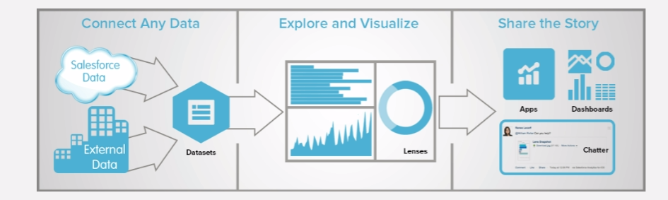
Analytics Process :When we login into analytics, it is redirected to home page, it shows all analytics assets like all apps, lenses, dashboards, datasets. Following is the detail information about these Assets.
1. Apps: It shows the different set of data analysis for the different purpose. We can share apps by creating dashboards, datasets, and lenses in relevant order. By default, we get some apps like:
- My Private App
- Shared App
- My DTC Sales
2. Dashboards: It represents data in form of charts, tables, and metrics that shows an interactive view of all business data.
3. Lenses: It is a form of saved exploration.
4. Datasets: Dataset is a collection of well-formed data. It is optimized for interactive exploration.
How to create new wave analytics org :
Following link is used to go to sign up page to create a new analytics org:
https://developer.salesforce.com/promotions/orgs/analytics-de
Interact Analytics Dashboards :Analytics makes business intelligence easy without knowing much more about all business data. It gives a pictorial representation of data which accelerates our business success. Firstly we will discuss dashboard, which is used to make data visualization and it also matches and compares all the internal data and external data. Analytics dashboard shows not only data details, it also shows a real graph of upgrading and downgrading business data.
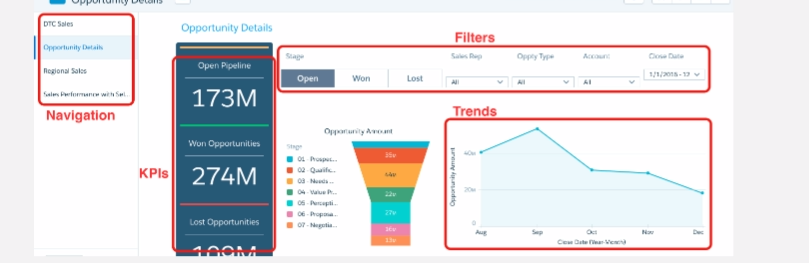
Details by Analytics :If we have a large business data, which is very complicated and you are familiar with its complication. How you will get all detail to help your reps focus and deals which had been closed. Follow it.
- If the navigation panel isn’t already open.
- Select Opportunity Details.Right away you point out the Open Pipeline KPI—this is something you want to keep remembering. The funnel chart shows stage status using easy-to-read induction. The line chart shows you the business over time. The stacked bar chart shows you an overview of each rep’s opportunities, and how they’re doing against quota. The table below the charts shows details.
- Click Won in the Stage toggle at the upper left of the dashboard.
- Click Open to see only open opportunities.

Now you can clearly analyze the promising 27M in the Perception Analysis stage in the funnel chart. But the line chart shows a major downward trend in opportunity amount since last September. You’re going to want to discuss both of these with your manager.
- Locate the Oppty Type widget, which lets you break out opportunities by type. Click on the down arrow, and select the New Business.Now the dashboard applies two filters. It shows you only open opportunities that are new business. Looking at the Sales Rep bar chart, you see that Nicolas Weaver has the most open new business. But what you really want to know is who’s holding the most in the Perception Analysis stage?
- Click the Perception Analysis section in the funnel chart and watch the names in the bar chart change places.
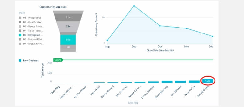
- Now we can see the magic of Analytics and how Analytics can help you navigate through your data to the insights you need. It’s as if Analytics is opening up the path before you, showing you the way.
Data Sorting : If we want to check top most DTC sales reps in USA, we need to use analytics dashboard to search it immediately. Now we need to check our third dashboard in our app.
- If the navigation panel isn’t already open, click on the menu bar to open it.
- Select Regional Sales.
- To filter the dashboard, click the USA bar.If you scroll down, you can see that the all the entries in the table is accordingly the USA as the Billing Country.
- To sort the table by amount, click Amount in the column heading. The up arrow appears in the heading. The values in the column are sorted in ascending order, and you can answer the question, “What are the top amounts?”
- To switch to descending order, click again.

- Hover at the corner of the bar chart to locate the drop-down menu, click to open it, and select Explore.

Finally, it’s a great job to handle our data using Analytics. In this, we can see how data is being tracked by analytics. It shows you a current status of business data by the dashboard. So Analytics is very useful to handle big data of our business.
Thanks


